Desktop projects
The mix of desktop projects throughout 2021-2023
Benefits focused category-specific landing pages
The main idea was to shift focus from chat-only subscription to chat + insurance benefits subscription. The primary goal was to increase conversion and retain more customers as with new offer service provides additional value-added features. The test is still running only for 2 categories and waiting for the readout.
My role. Led the project from 0 to 1 in close collaboration with the product manager and UX writer.


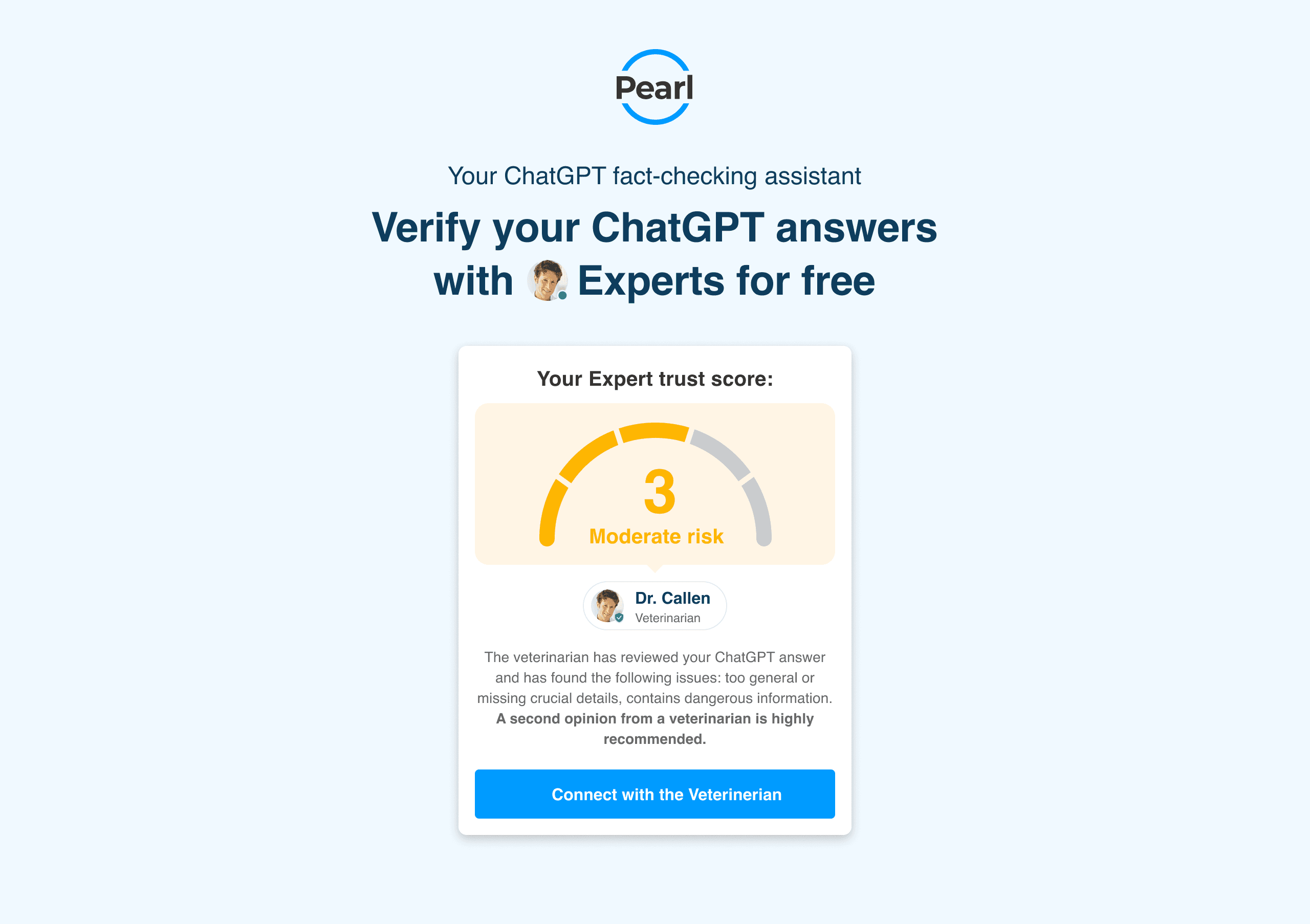
Landing page and verification flow for the ChatGPT plugin
The idea was to explore an additional acquisition channel through the ChatGPT capabilities. While using ChatGPT-4 users can activate the Pearl plugin and ask ChatGPT various questions. Once user receive an answer, we offer them to verify this answer with real Experts. If user agrees, we redirect them to the separate dedicated verification flow where user can request verification from the real Experts. Expert provides a score from 1 to 5. Afterward, user can connect with the Expert if they need in-person conversation.


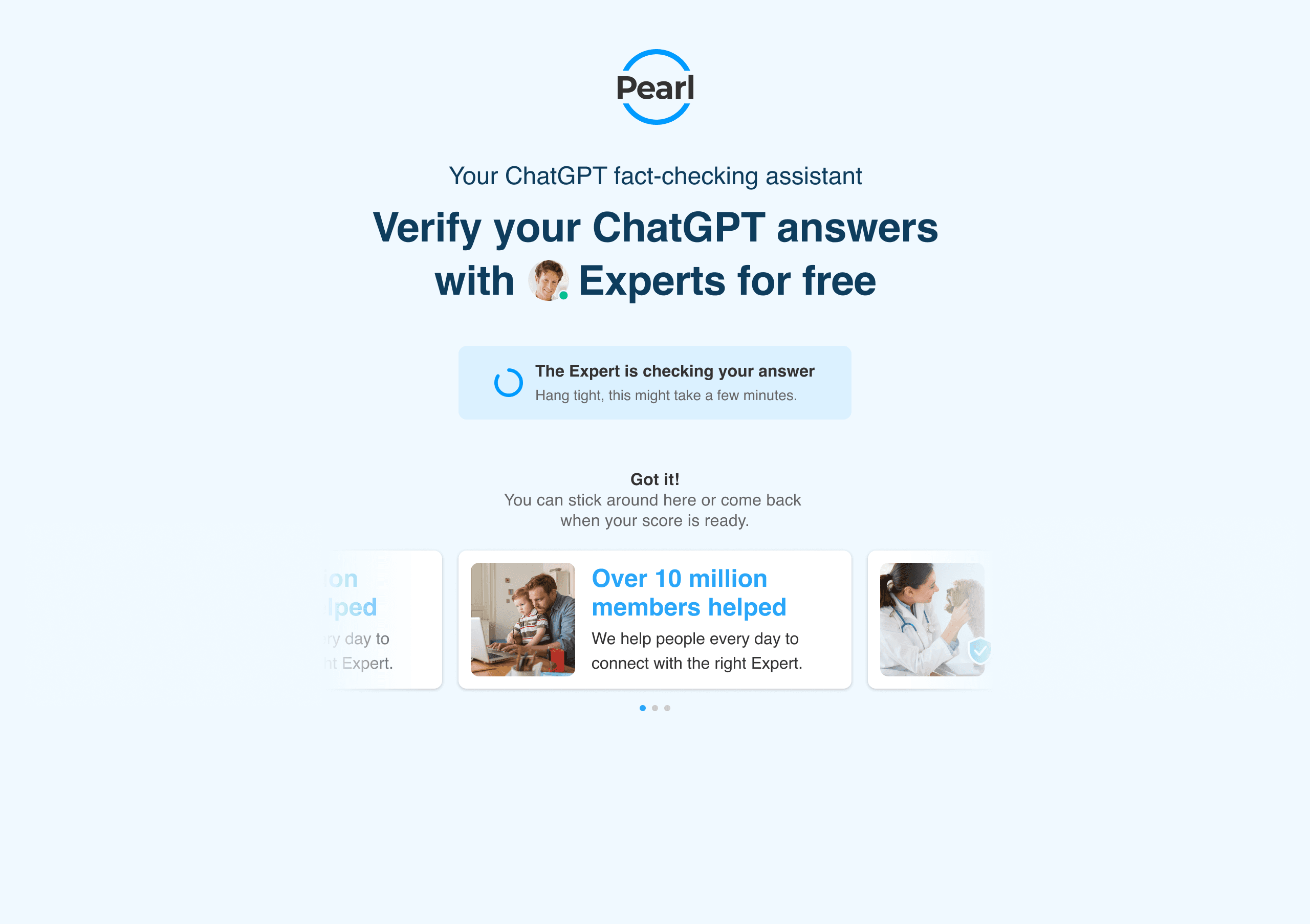
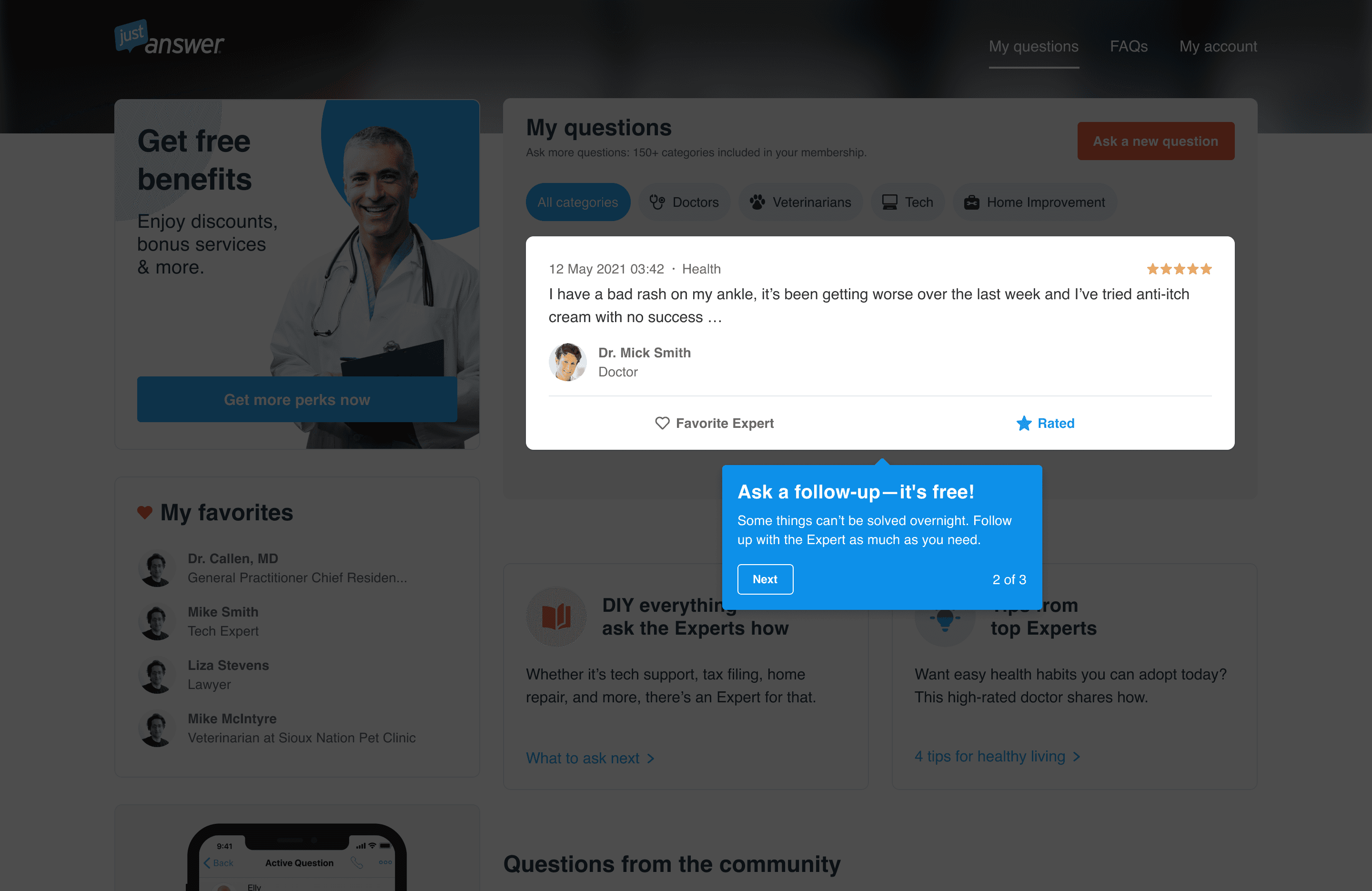
Waiting room and chatbot design
Originally, the waiting room flow consisted of 5 static screens that user had to go through. We've completely redesigned the experience for the waiting room by providing a conversational design approach using an AI assistant and providing a single-page experience.
While user is waiting to be matched with the Expert we ask them to provide their name to personalize their experience afterwards. AI assistant also asks follow-up questions based on the issue the customer addressed on the initial landing page.
Currently in a development phase.
My role. Alongside with Conversation designers and product managers established a new chatbot flow, script, and new UI.


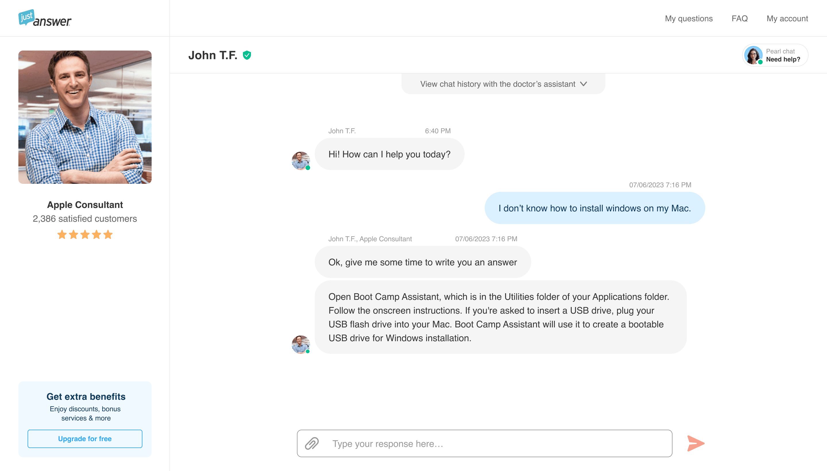
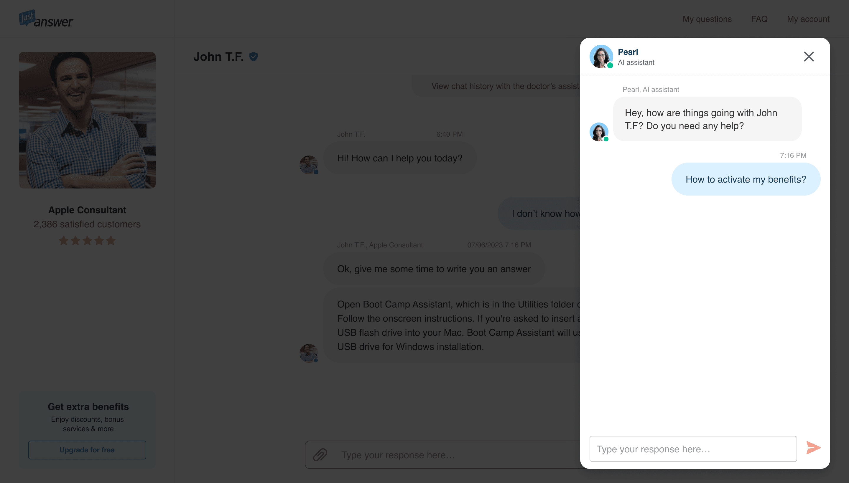
New desktop chat experience
I led a redesign process for the new desktop chat experience. The redesign also included the introduction of a proactive AI assistant that would help users solve their entire problem.
Scheduled for 2024.
Customer dashboard onboarding
Once we introduced a new desktop dashboard experience, we had to educate users about the new layout and features added. So we did a short onboarding flow that educated users about the new major features.
The onboarding had good results educating users and helping them adopt new features. 63% of users interacted with category selectors. 23% of users asked a new question in a different category. Retention improved by 5%.


Meme generator startup home page
I helped a US-based startup to design an interface for the meme generator home page. On this page, user can upload any video they want to use as a foundation for their meme and afterward edit this video in a separate editor by adding additional text or images. Users can track published and WIP videos as well as work on the videos from the request center.

Tax compliance software solution
Led a redesign process of the legacy native desktop application and crafted a new experience for the web-based app. Was part of the discovery team alongside with BA and Architect. Conducted workshops, user and stakeholder interviews.


