JustAnswer.
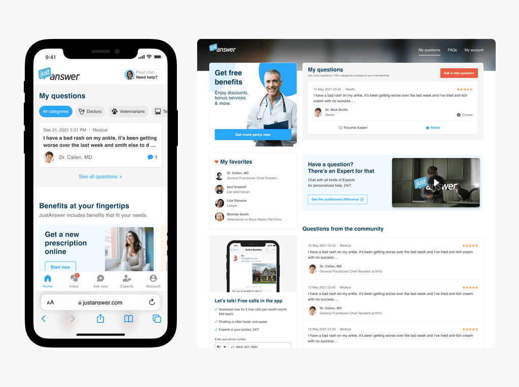
Desktop customer's dashboard
The customer's desktop experience redesign emerged from the mobile strategy and web mobile redesign.
Role
Led a redesign process in close collaboration with product managers, UX writers, analysts, and engineers. Alongside with 4 other designers worked on establishing a shared design system.
Year
2023
Problem
The desktop experience hasn't changed since 2012, had a lot of usability issues, and was implemented using outdated technologies. It all resulted in a negative impact on the users and the businesses.
By that moment we had already launched and proven the success of the new web mobile experience. We wanted to be lean, so the idea was to adjust the new mobile experience to the desktop by reusing the same patterns and components.

The legacy desktop customer's dashboard
Redesign approach
So, the general idea for the desktop dashboard redesign was to make the layout as flexible as possible. We decided to make the layout modular by breaking it into separate blocks. In the future, that would allow us to introduce and test any new ideas much faster and without changing the whole layout.
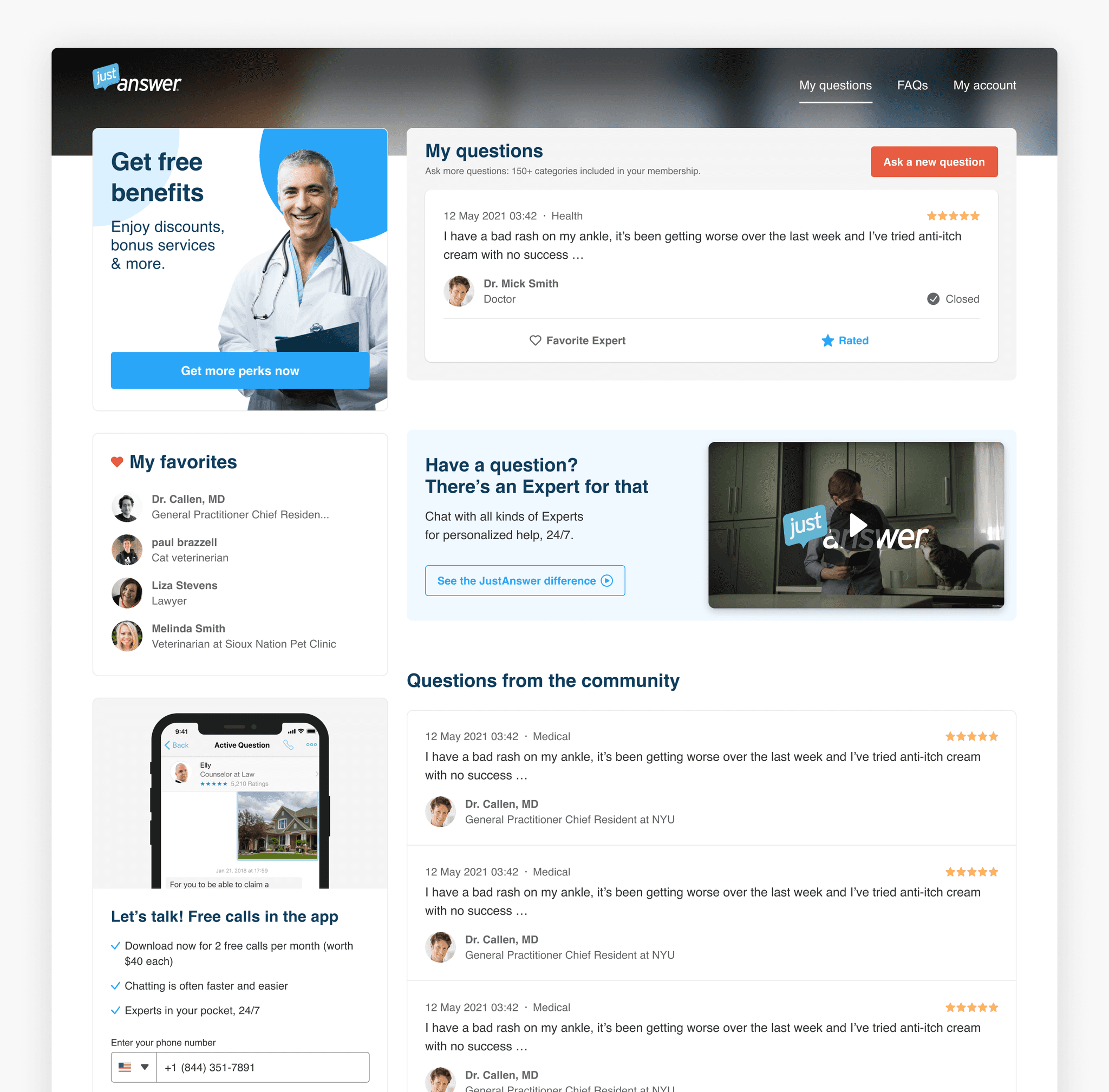
My questions
"My questions" section is divided into two parts: active questions and past questions. Active questions are always visible at the top section and past questions are hidden under the expandable section.
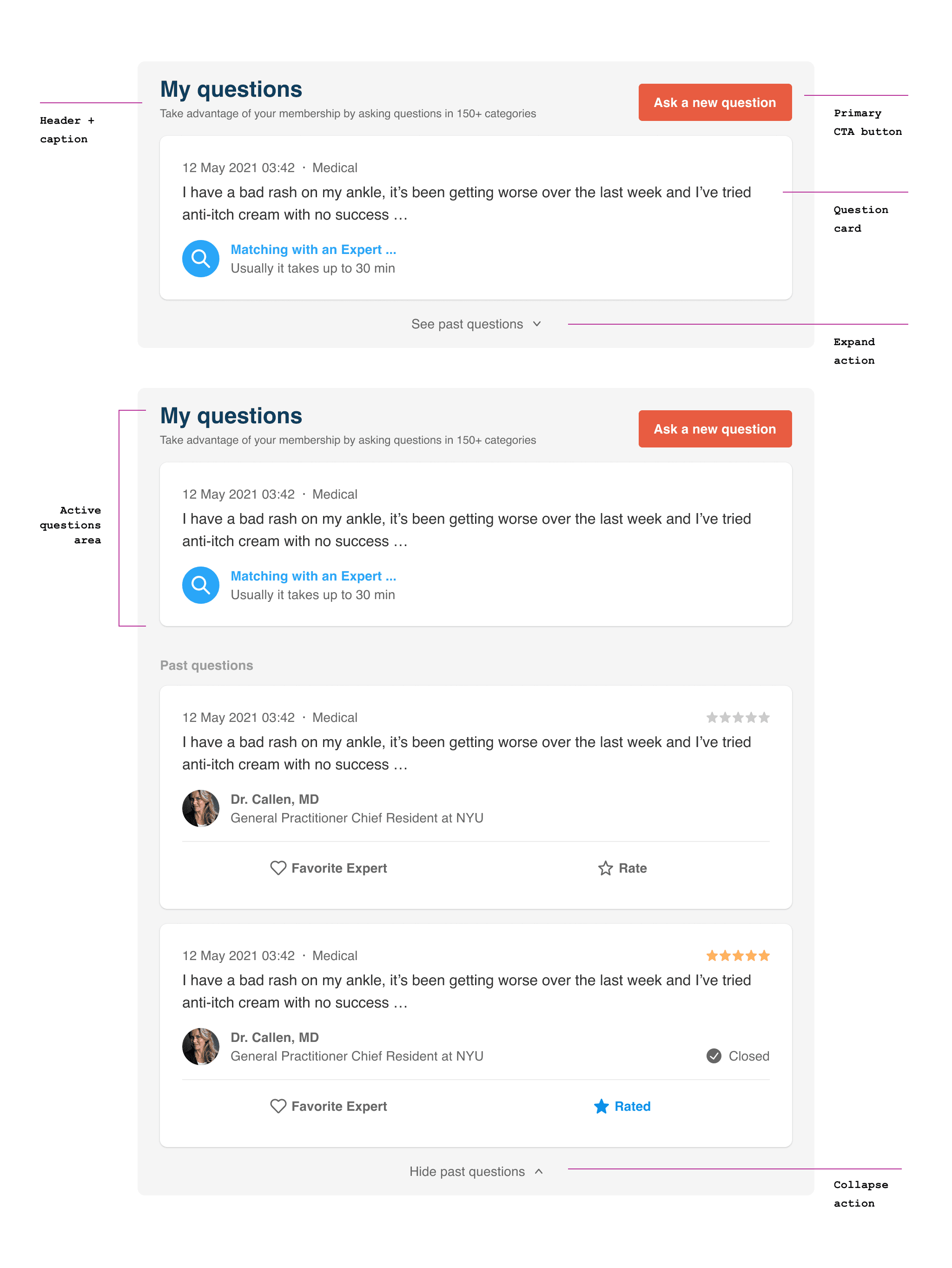
Question cards
Question cards provide users with all the information related to their questions like time, category, expert assigned, and status. Also, users can rate or favorite the expert right from the card

Benefits
Benefits are always included in the user's membership and need to be activated if a user would like to start using them. We designed 3 states for the Benefits card: Not active state, Activating, and Activated.


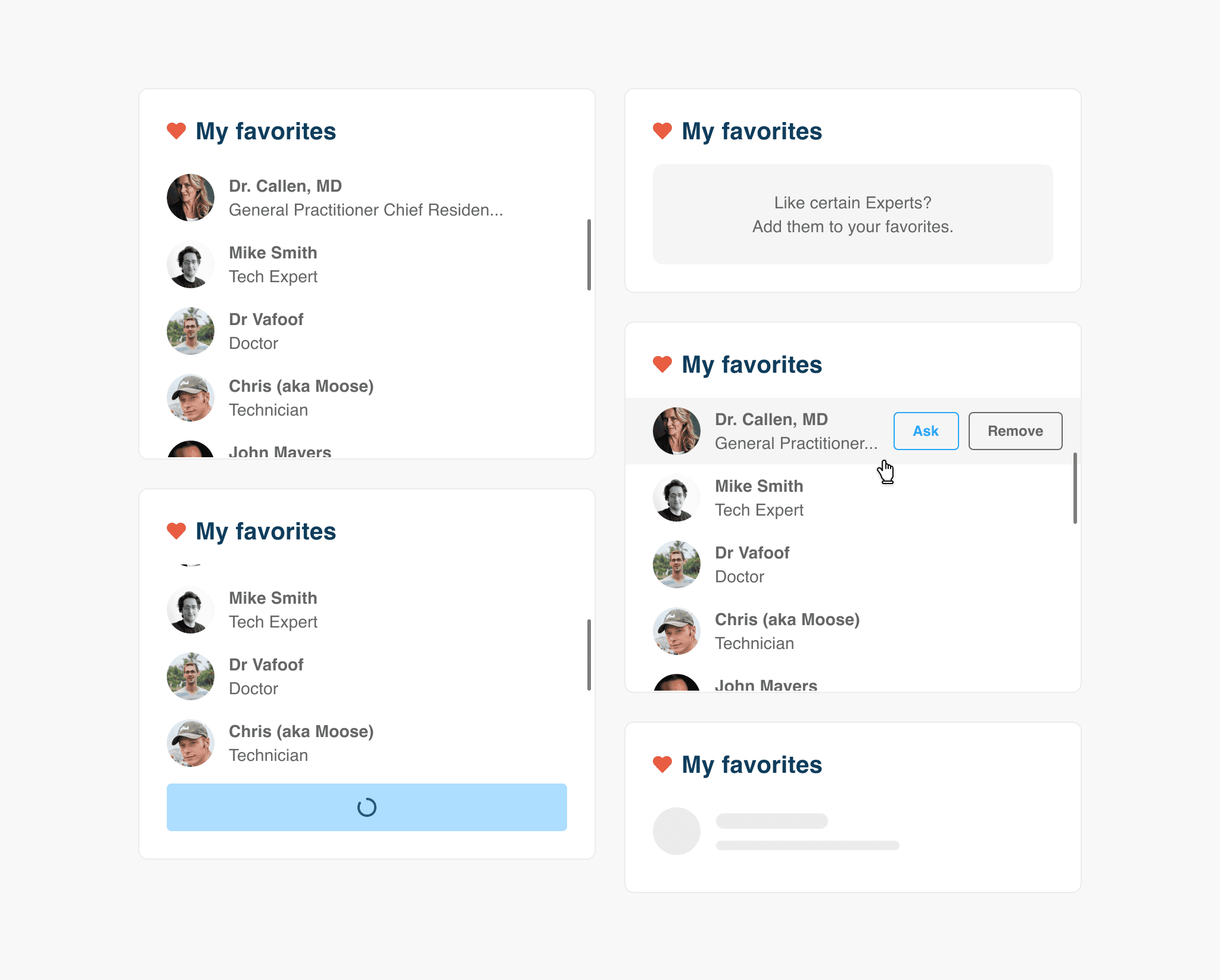
My favorites
Users can add any expert to their favorites and have quick access to them to ask a new question. If a user still has no favorite experts he will see an empty state
Responsive design
The desktop layout is fully responsive and is adjusted to the tablet and mobile views.
Design system
The whole redesign process also included establishing a shared design system and building reusable components across desktop and mobile views

Shared design system and components are published in Zeroheight
Results
We ran an experiment (50/50) for about 2 months and observed a +2% lift in LTV35 and -2,73% in a refund rate.
↑2%
LVT35
↓-2,73%
Refund rates
The results were not as promising as we expected but given the fact that main metrics went slightly up, we decided to normalize the new desktop experience for all users. That also allowed us to provide a consistent experience for both desktop and mobile users.
Final mobile and desktop customer's dashboard experience
A new redesigned desktop and mobile views using shared components from the design system.